Calbee ポテトチップス
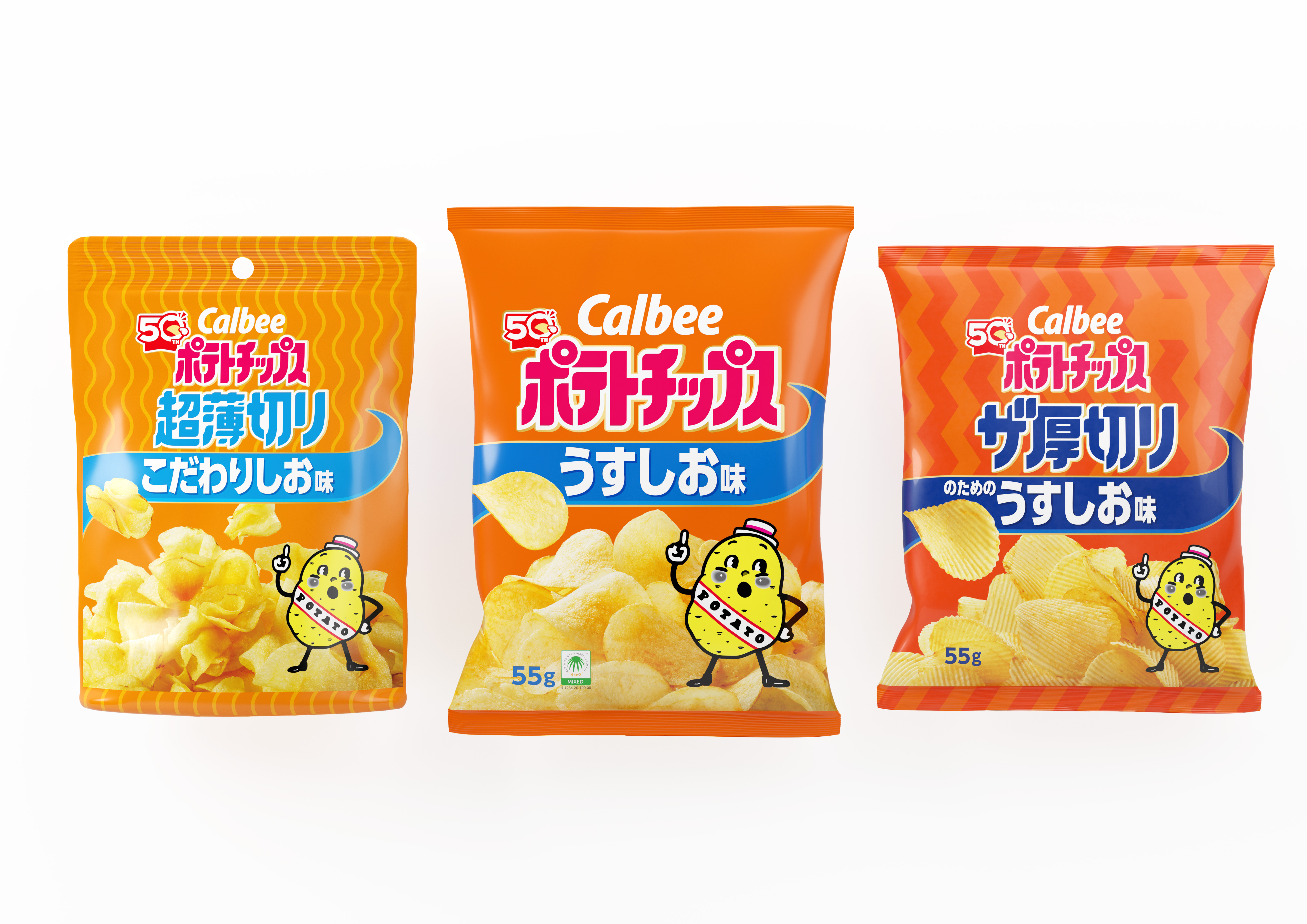
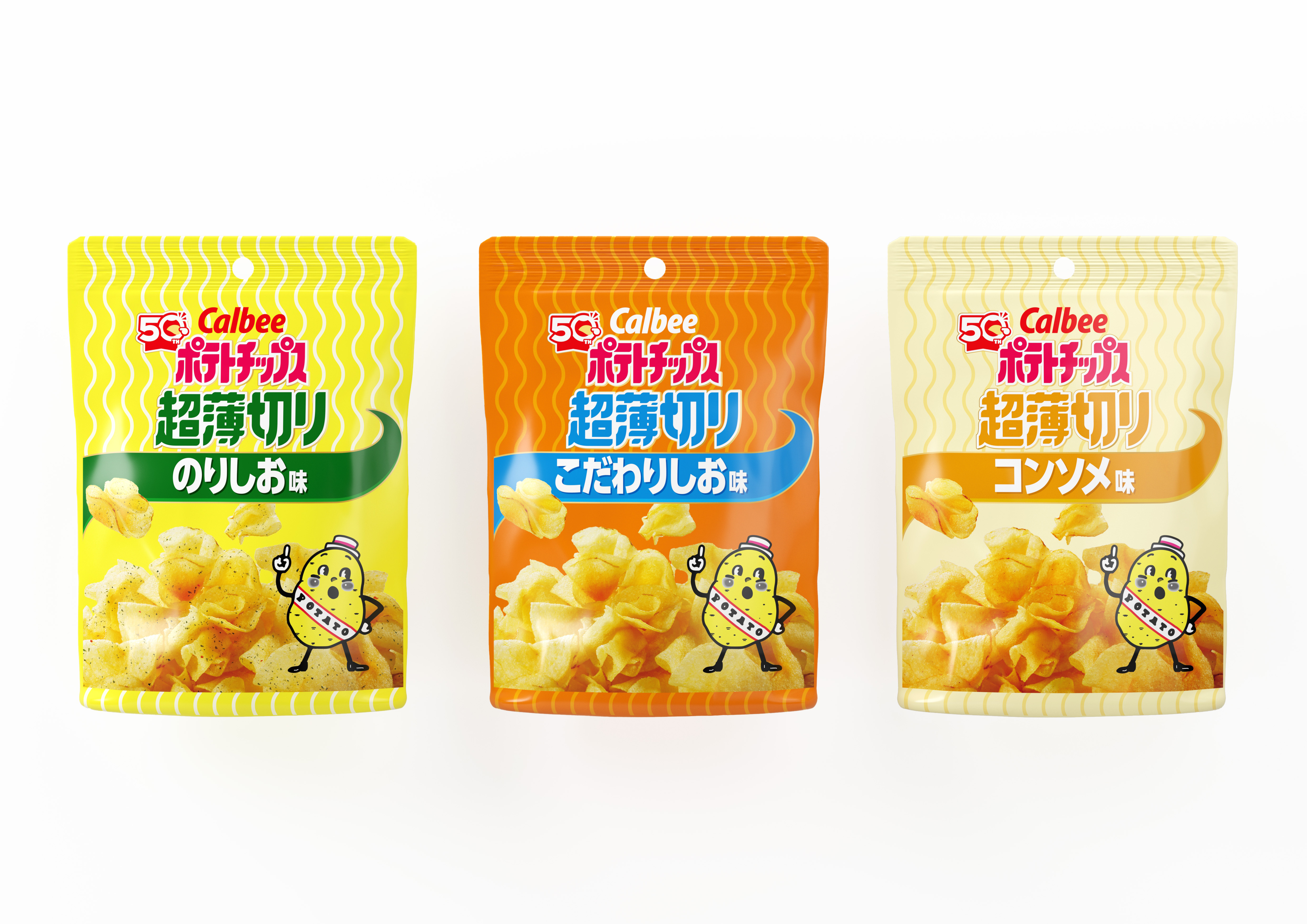
To commemorate the 50th anniversary of Calbee Potato Chips, I was responsible for the packaging redesign and the visual design of the anniversary campaign and events.
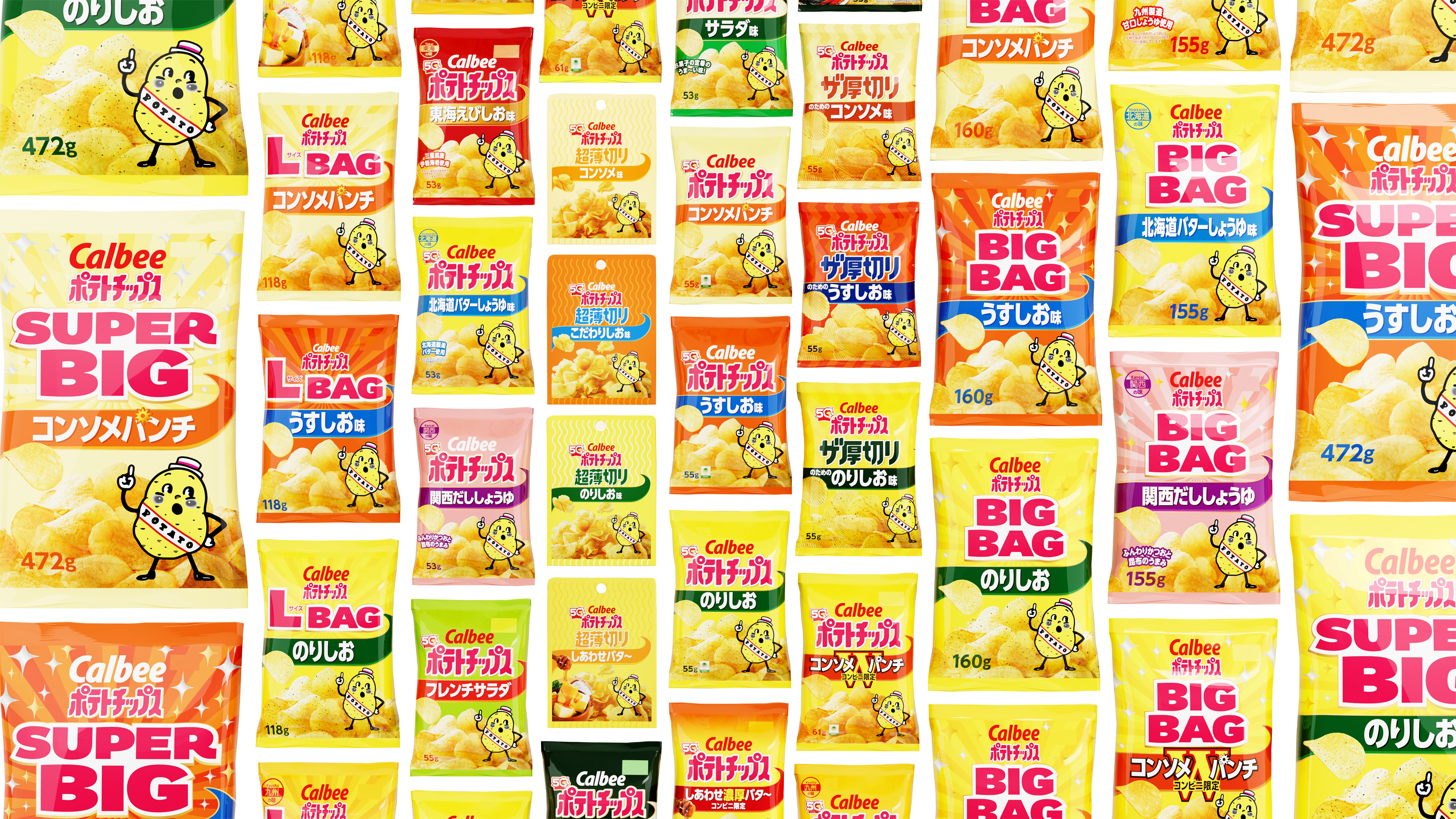
The redesign was applied across the entire Calbee Potato Chips portfolio, including product variations such as Ultra Thin Cut and Extra Thick Cut, creating a unified and cohesive brand identity.
A signature ribbon-like graphic called “Calbee Way” was introduced as the core visual element, extending from the potato chips as if unfolding into a road. “Calbee Way” embodies the idea that, as Calbee Potato Chips celebrates its 50th anniversary, the brand will continue its journey into the future, forging new paths ahead.
The renewed design system has since been expanded across a wide range of products within the Calbee Potato Chips brand.


Contact
Please feel free to contact us from the form below for inquiries about production requests.
contact