TAISHO FELLOWS Rebranding
Hand Inc. led the rebranding for Taisho Fellows, a group that addresses issues related to people, the environment, and everyday life.
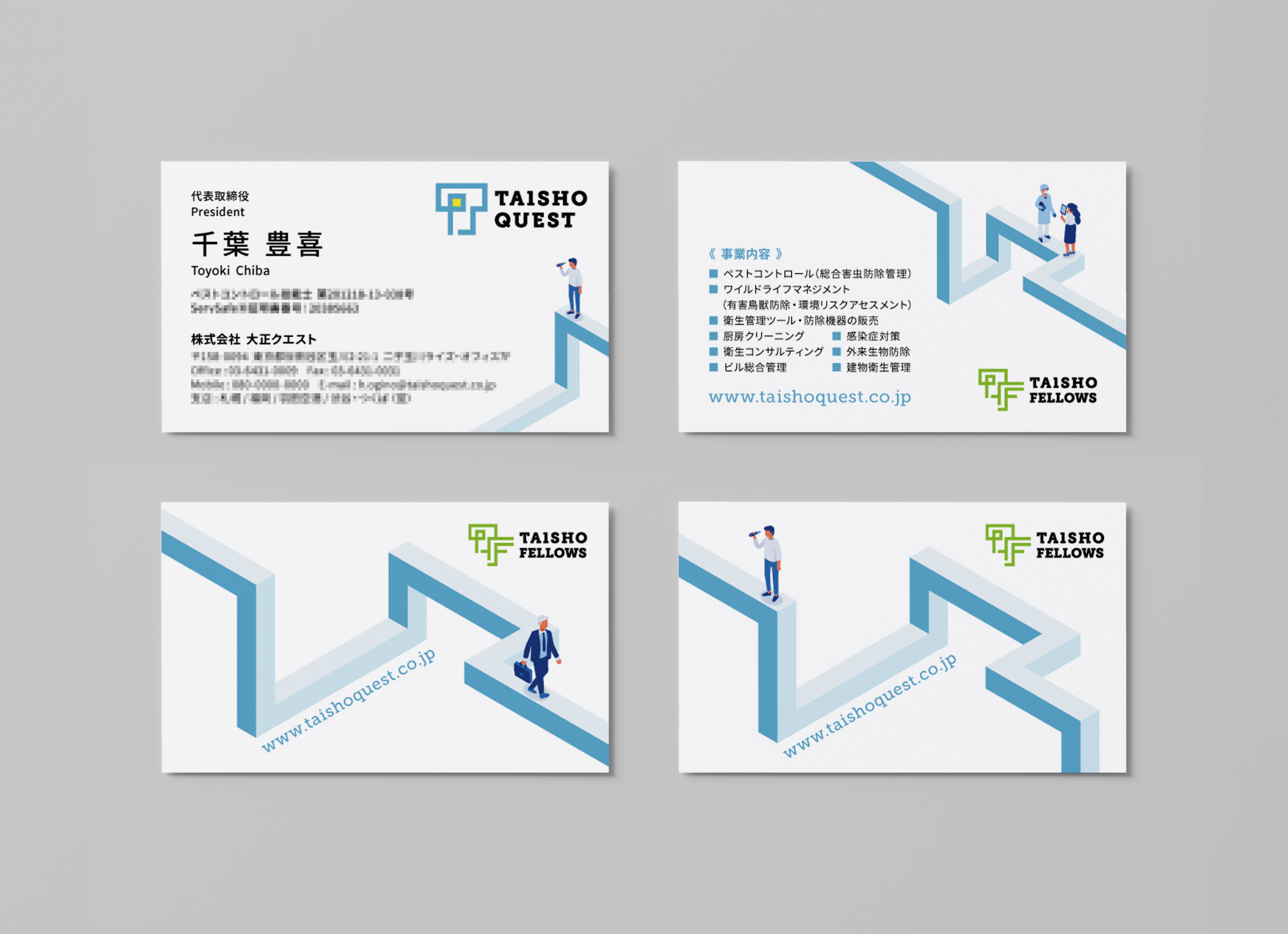
We developed a wide range of materials including the tagline “Solving the challenges of society.”, the logo, business cards, videos, and the website.
Centering on the blue “Quest Line,” which represents the group’s spirit of exploration, we used illustrations and animations to create a design that intuitively communicates that this is a corporate group closely connected to daily life.
TAISHO FELLOWS LOGO
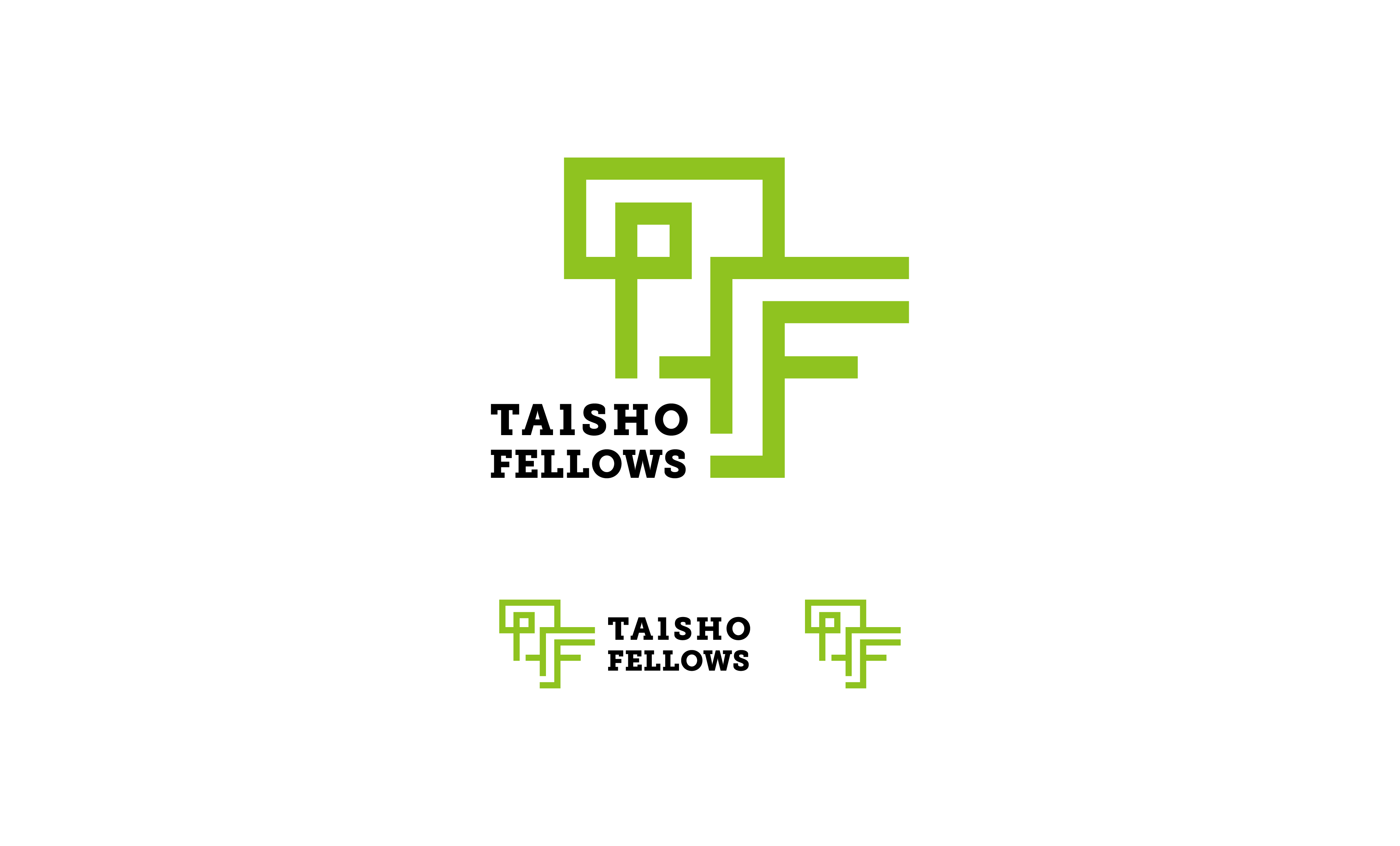
At the origin of everything TAISHO FELLOWS does lies a spirit of “exploration.”
The corporate green embodies the sense of “peace,” “safety,” and “harmony” found at the end of that exploration.
The logo mark is constructed from interwoven lines shaped from the initials “T” and “F,” representing an endless “path of inquiry” that follows one question after another.
And the partially missing letters in “TAISHO” intentionally leave the logo in an “unfinished” state. This expresses an attitude of never considering completion the goal, but continuously asking, “How can we make this better?”
Within this logo resides TAISHO FELLOWS’ unwavering commitment to lifelong exploration.
TAISHO QUEST LOGO
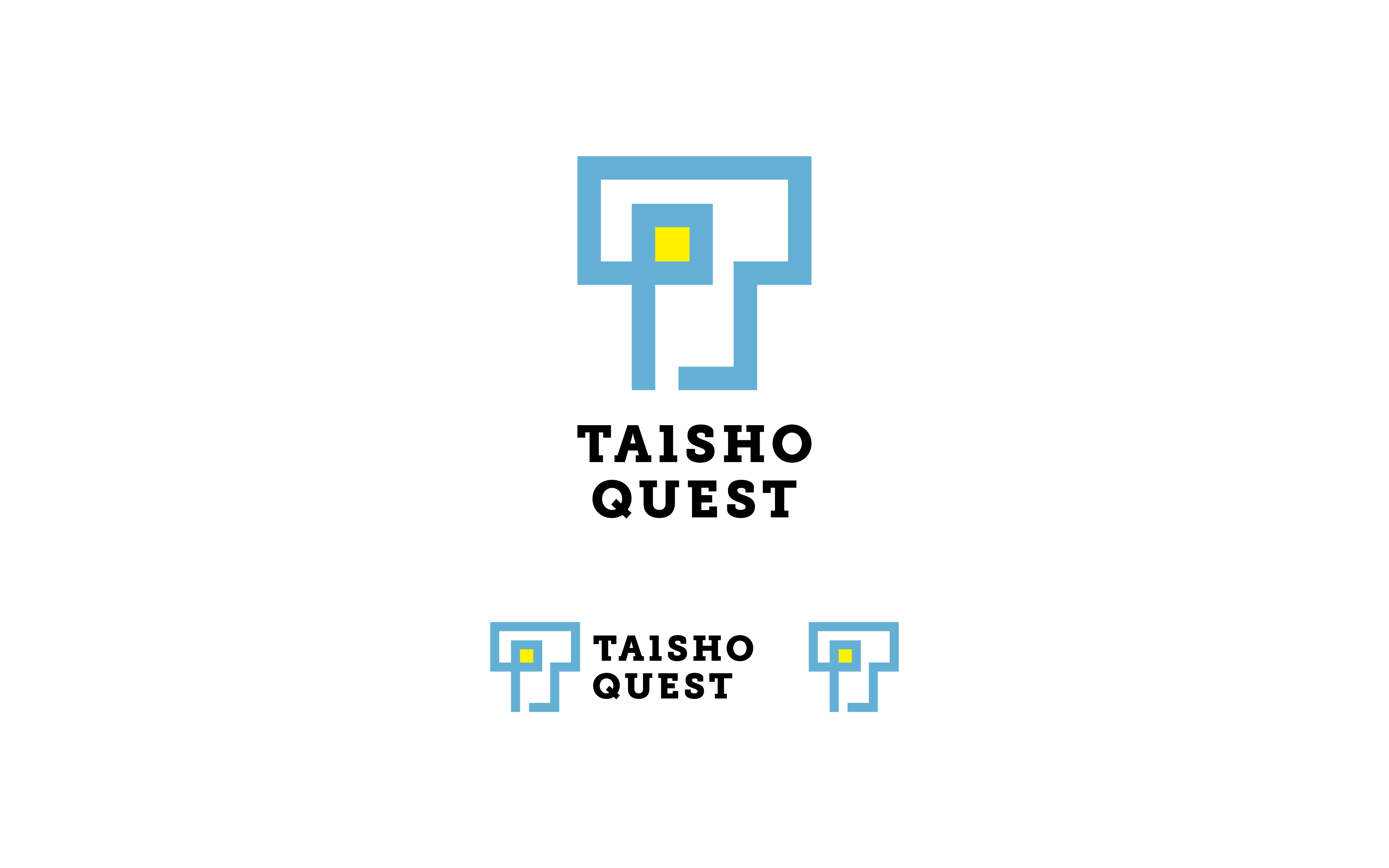
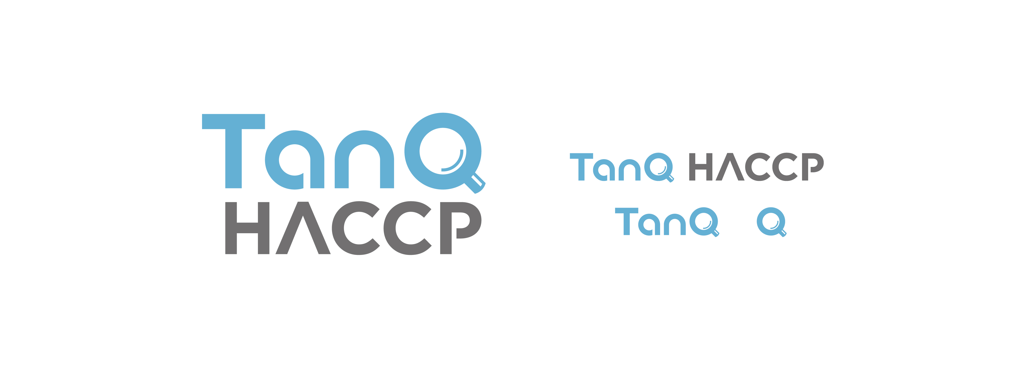
As part of the rebranding, we designed the logo and business cards for Taisho Quest, as well as the service logo for TAISHO HACCP, Taisho Quest’s HACCP support service.
The corporate blue represents sincerity, trust, and the idea of “all of us living together on this planet.”
The yellow symbolizes the insight and light of hope that emerges at the end of exploration.
The logo mark is built from the initial “T,” using interwoven, path-like lines to depict the never-ending “journey of inquiry.”
Art Director : Hideto Yagi
Designer : Yuichiro Shinomura / Ayuka Miyagishi
Movie Designer : Kentaro Tanaka
Contact
Please feel free to contact us from the form below for inquiries about production requests.
contact